Beyond Letters – Exploring Form, Process & Meaning
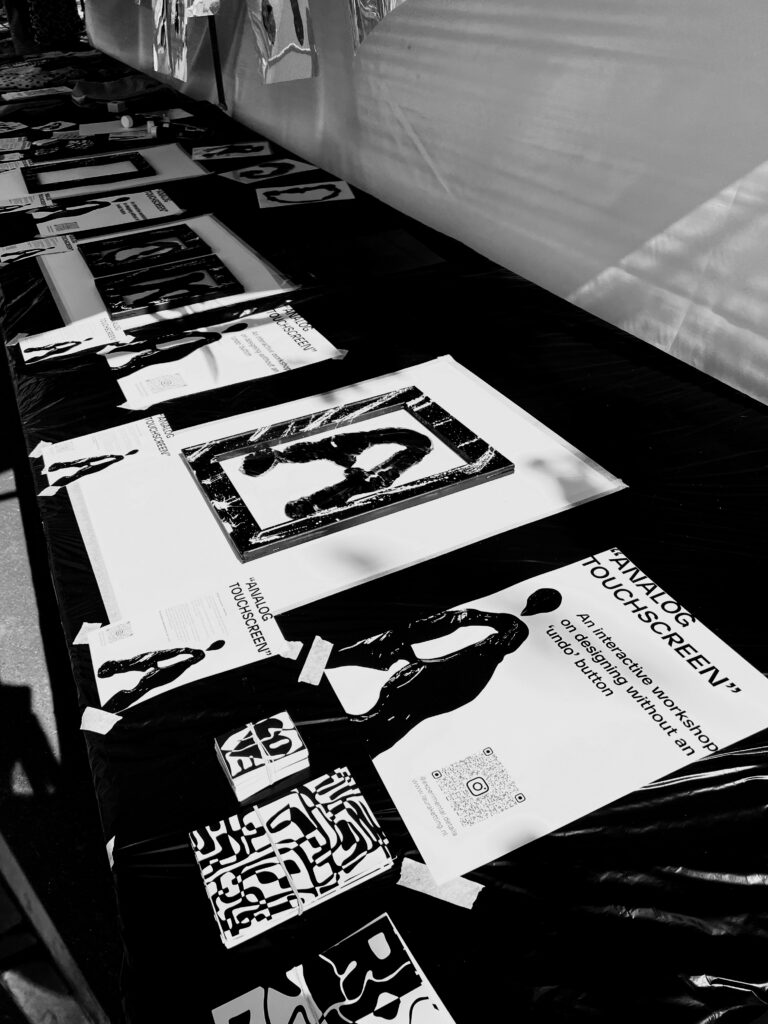
Laura Ketting, an experimental artist from Rotterdam, is renowned for her innovative approach to graphic design and typography. As a graphic designer and typographic artist, she extensively uses diverse materials in her work, uniquely influencing the readability of the letters. For Laura, it’s not about creating perfectly readable letters but about developing a unique experience where the letters themselves take center stage.
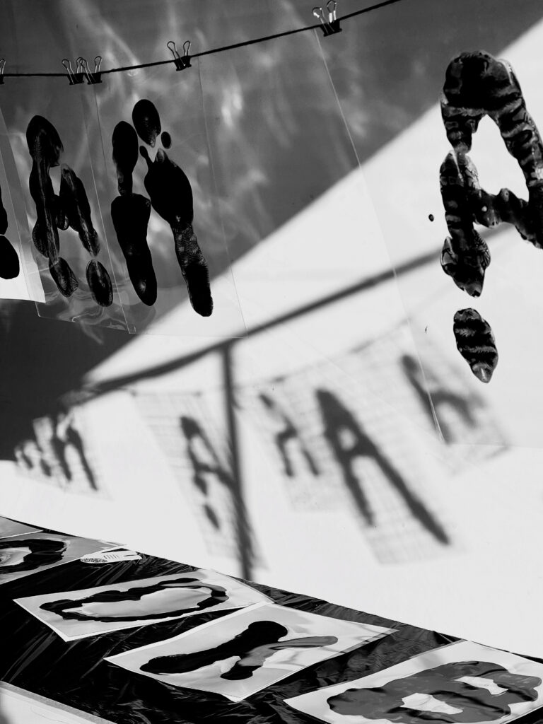
By choosing only black and white, she focuses entirely on the form and structure of the letters, bringing the essence of typography to the forefront. This minimalist color palette ensures that the viewer can fully immerse themselves in the images and letters Laura creates. She plays with contrasts and textures, making each letter a work of art in itself.
The process plays a crucial role in Laura’s work. She draws inspiration from making mistakes within the process, as these often lead to unique outcomes. Laura’s work invites exploration and wonder. The combination of materials and the monochrome approach ensures that her letters and images offer a visual experience in which one can get lost.
Her art challenges the viewer to look beyond the traditional boundaries of typography and discover the interaction between form, material, and meaning.
“By making you will see By seeing you will make”
Workshops & Talks
In addition to her work as a graphic designer and artist, Laura Ketting also gives workshops and talks. This began with her graduation project, where she explored legibility in typography and how shifting perspective can open up new ways of thinking and creating.
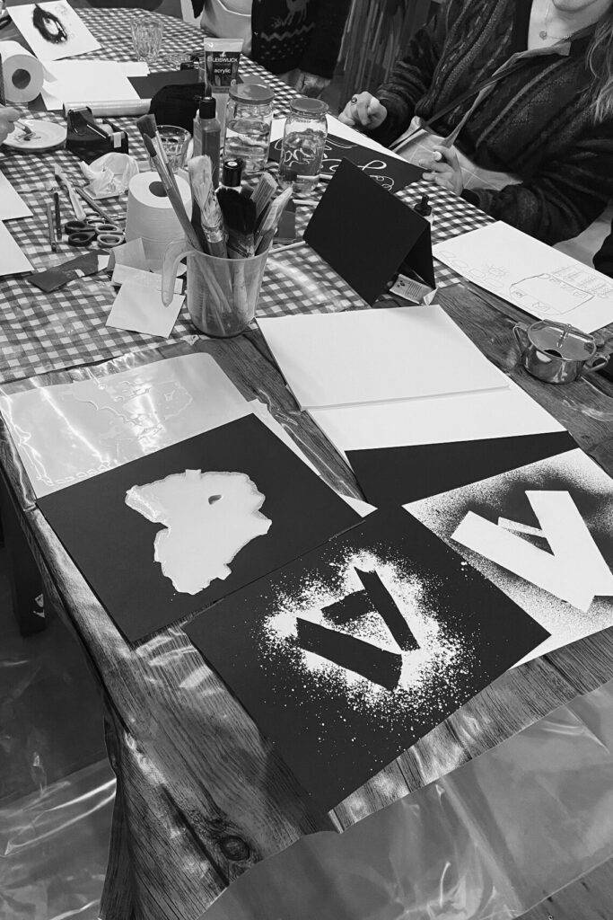
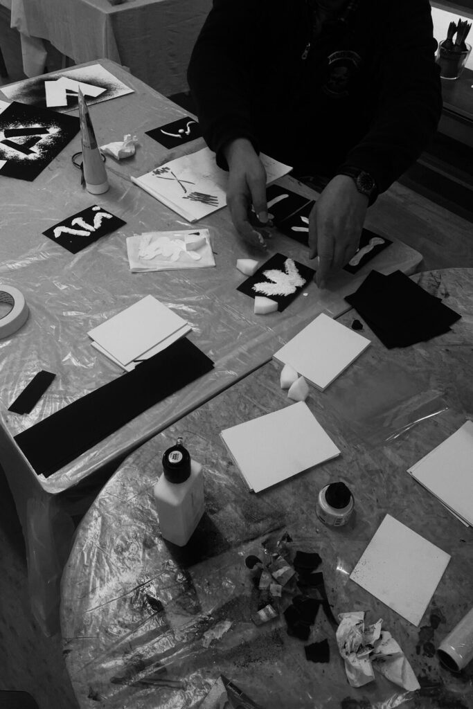
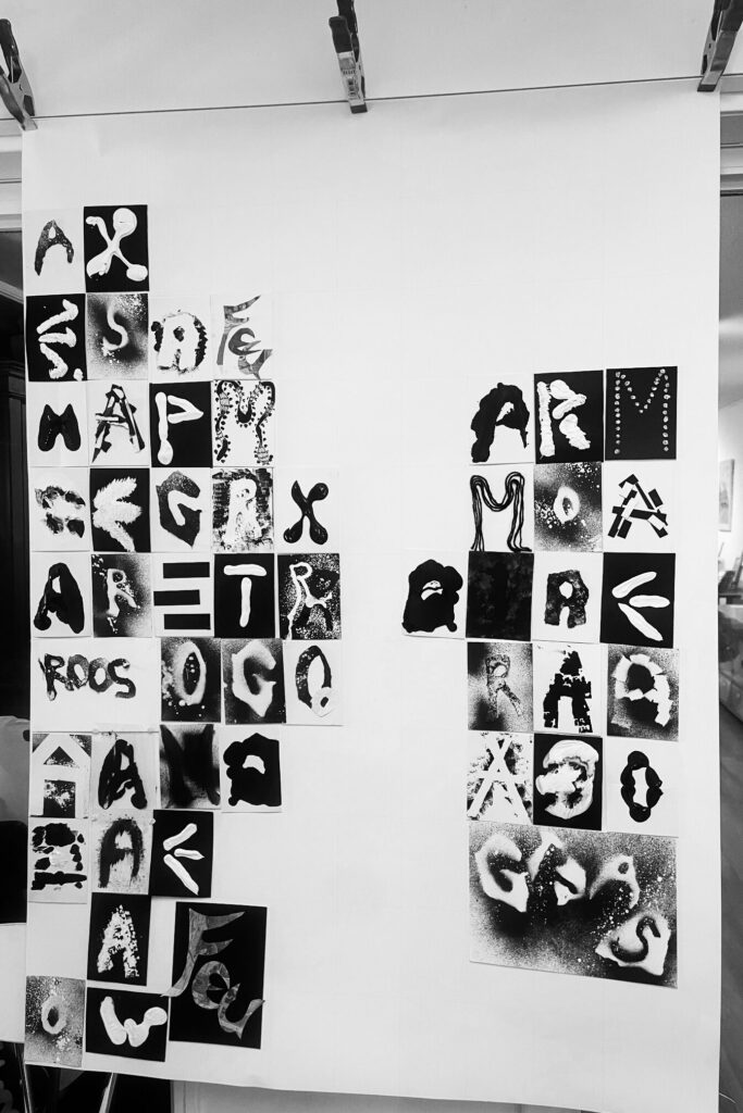
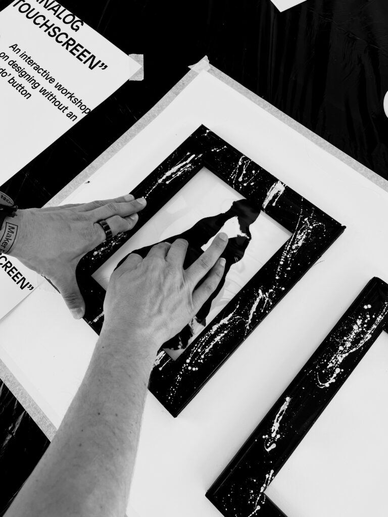
In her workshops, Laura invites participants to look at their surroundings differently, searching for shapes that resemble letters, like a fence that looks like an A. These found forms are then traced, transformed, and expanded into complete alphabets, which can even be turned into usable typefaces. All in black and white, to keep the focus purely on form.
This method trains the brain to see differently. By simply starting to make, you’ll begin to see more and more.
By making you will see, by seeing you will make.
In her talks, Laura shares more about this process and her creative mindset. In the workshops, participants dive in and experience it for themselves.
Interested in booking a workshop or talk?
Feel free to get in touch via email: hello@lauraketting.nl
